UX for Power BI
Transform Data into real Insights
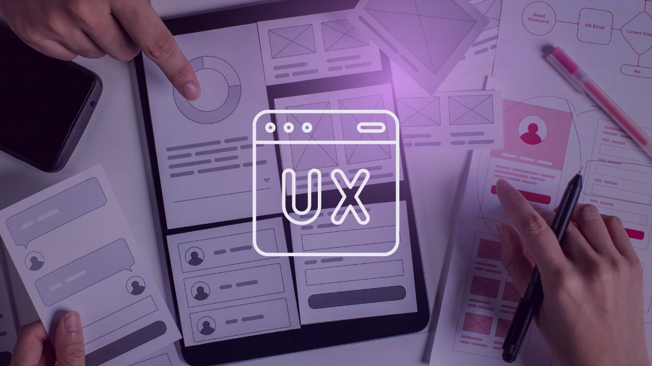
Data visualization is not just about design - It’s about discovering new ways to see and understand your data. UI/UX best practices, integrated into a structured design methodology for Power BI dashboards, will support and streamline your adoption process. Discover how!
Transform your data into powerful solutions with UX for Power BI
Streamline Power BI development with a proven methodology that reduces complexity and accelerates delivery, allowing developers to focus on what matters most—data quality and performance
Empower your analytics team to create meaningful data solutions that prioritize user experience, optimize processes, and drive decisions based on actionable insights tailored to your business needs.
We will follow an agile methodology which ensures every step of the process is transparent and adaptable, giving you confidence that your design stays on track and evolves to meet your goals without surprises.
During a dedicated session, we’ll follow a structured methodology to define the KPIs, the report’s structure and navigation. By involving end-users throughout the process, we ensure an analytical solution perfectly aligned with your strategy.
5 steps for providing better insights
Investigate
To concretize
Concretize
To Design
Design
To Validate
Validate
To implement
Implement
To act
Highlighted UI/UX services for Power BI design
Workshops and methodology for co-creating reports in Power BI
Dare to break the routine for a day and forever change the way you conceptualize your reports. Following a methodology inspired by Design Thinking and grounded in UX for Power BI, we will define KPIs and design the navigation and components of a report, aligning ourselves with the objectives and workflows of end users. Discover a dynamic and engaging way to involve the business in the development of dashboards and in the creation of data products
Development of corporate design system for agile report generation
Based on the graphic identity of your brand and the values of your organization or department, we will work iteratively to develop and provide a corporate design system in Power BI. A design system is much more than just a theme; it includes colors, fonts, button styles, menus, templates, and more. In summary, it’s a set of components designed to optimize and enhance the way you create dashboards.
Better decisions starts with better insights!
My name is Paula García Esteban, and I have developed a unique methodology that combines agile practices with UX best practices to design reports and help developers and data analysts optimize their design process in Power BI.
I am a Microsoft MVP in Data Platform and Artificial Intelligence, an instructor at LinkedIn Learning, and a Power BI Core Visuals Community Representative.
Let’s connect to explore various ways we can collaborate and work together. I can support you with project development, provide training, and assist with data-culture adoption.
Microsoft MVP in Data Platform and Artificial Intelligence


Client Feedback & Reviews
Case Study

Turn your data into business value improving your dashboards with UX for Power Bi
Harness the full potential of your data and turn it into actionable business value. By adopting this UX methodology, your dashboards will deliver a clear, real-time view of key metrics, enabling you to make confident, informed decisions and drive impactful progress. Elevate your decision-making process and uncover new opportunities for growth and success.


